All the big names in color have officially announced their 2021 Color of the Year choices, predicting color trends for home décor, fashion and graphic design and also the perceived collective mood of our times as defined by each company. Here’s the breakdown:
Pantone 2021 Colors of the Year:
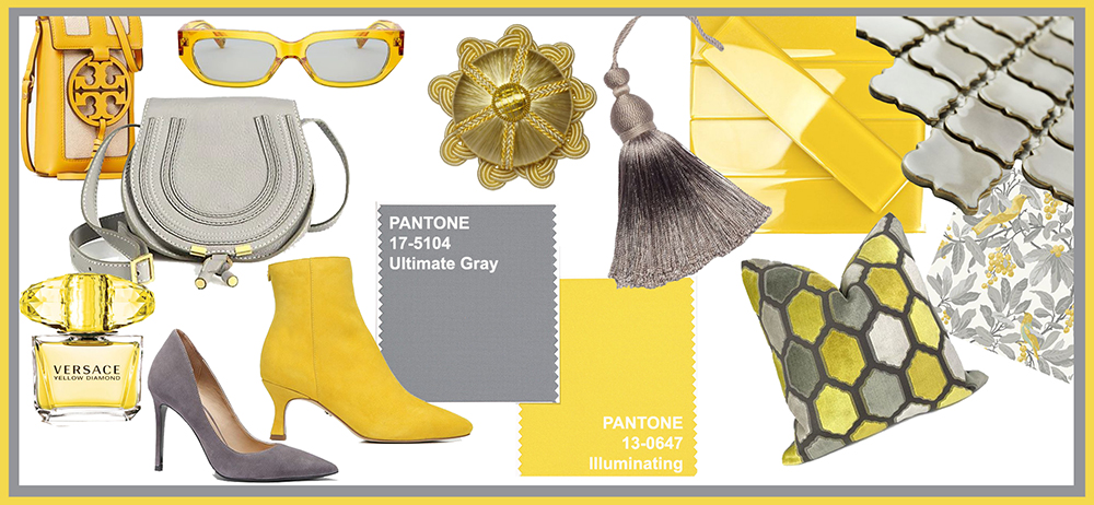
Ultimate Gray + Illuminating

Pantone has selected two Colors of the Year for 2021: 17-5104 Ultimate Gray + 13-0647 Illuminating. The colors were chosen to represent how disparate elements can work together.
Ultimate Gray represents stability, practicality, and resilience, evoking long-lasting, weathered earth elements like beach pebbles, sturdy old tree bark and iron. This color stands the test of time, enduring with wise, quiet composure. This color makes your home feel cozy and safe.
Illuminating is a cheerful and optimistic yellow, evoking the sun, lightning, and bright bursts of energy. This color is bold, vivacious, warm, and hopeful.
Combining the two colors is meant to express “positivity supported by fortitude, resilience and hope…pressing us forward toward new ways of thinking.”
Visit our pinterest board for some ways you can incorporate these colors into your life. Click the video below to see Pantone’s ultra-cool digital intro of their top picks:
Sherwin-Williams 2021 Color of the Year:
Urbane Bronze SW 7048

The Sherwin-Williams Color of the Year pick for 2021 is an elegant, calming, and versatile gray. Sherwin-Williams describes it as “embodying the richness of the Earth’s stone, metal and wood … forging a feeling that’s grounded, meditative and serene.” This is a perfect color to bring into our homes to help keep our hearts and minds healthy during challenging times. See more examples of how to use this beautiful hue on our pinterest board. Click the video below to see Sherwin-Williams plumb the depths of this earthy, serene color pick.
Benjamin Moore 2021 Color of the Year:
Aegean Teal 2136-40

Premium paint company Benjamin Moore picked Aegean Teal 2136-40 as their Color of the Year for 2021. This soothing, dusky blue could have been plucked from a summer sky or the depths of a crystal clear sea. Simple and warm, it feels like home and comfort. See ways to incorporate the gorgeous color into your home and your life on our pinterest board. Click the video below to see the story of this color from Benjamin Moore.
Farrow & Ball 2021 Colour Palette of the Year

British manufacturer of designer paints and wallpapers Farrow & Ball selected 12 rejuvenating hues in four distinct palettes for their Colour Trends Palette of 2021. They state “we see 2021 colour trends that reflect our recent collective journey – towards more time spent indoors, emphasis on sanctuary, and the need for rooms that enhance our wellbeing. We think you’ll agree that’s a lot to sum up in a single Colour of the Year!” The 12 hues are versatile, warm, comforting, and luxurious. View the full 12 colour palette and it’s many uses on our pinterest board.
PPG Paints 2021 Paint Color Palette of the Year

PPG Paints chose three colors that “bring warm lightness and a sense of calm to a space” as their Color Palette of the Year for 2021. Transcend is a nostalgic, earthy oatmeal-beige. Big Cypress is a ginger hue tinted with persimmon that they call a “hug” for your home. Misty Aqua splashes the color of the sea into the earthy mix. Collectively titled “Be Well,” the colors are neutral, serene and versatile and celebrate making wellness a priority. See the full 2021 color palette on our pinterest board.
PPG-owned Glidden paint brand went a different direction starting in 2019. They chose a Staple Color for 2020 that they predicted will trend for many years to come. This honor went to Whirlwind PPG1013-3, a “fail-proof cool gray with a touch of blue” that will pair well with a variety of accent colors.
This year, they reinforced their staple color choice and continued their rogue path by starting a brand new category: 2021 Accent Color of the Year. Their pick for 2021 is Aqua Fiesta PPG1147-4, similar to PPGs Misty Aqua. Paired with the staple Whirlwind, this festive color brings just the right amount of bright and happy while still being natural and comforting. Apply this color to your trim or an accent wall for a splash of brightness in 2021 while still being comfortable and safe within “staple gray” walls.

Everyone seems to agree that we need to feel comforted and safe in our homes while staying hopeful, harkening back to simpler times, evoking the wellness of nature, splashing in positive energy while keeping serene in our stay-at-home spaces. Here’s to a happier, healthier 2021!