The 2017 Colors of the Year have all been announced and they offer the promise of bold, vibrant shades and depth of layers. Here is the lineup:

An interesting mix capturing an array of moods: light and calming, dramatic and intense, bright and hopeful, and timeless and earthy. Yet they can all work together in a cohesive palette should you choose to incorporate them all into your color scheme. Let’s check out the breakdown from the color experts.
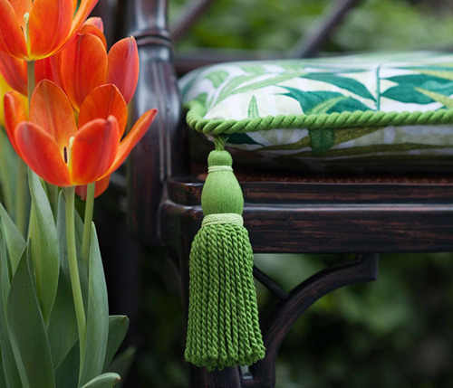
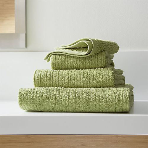
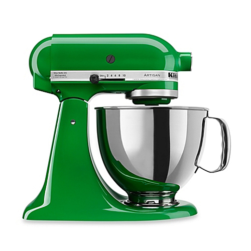
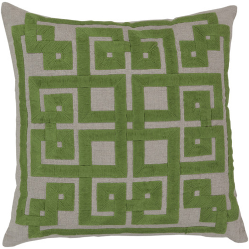
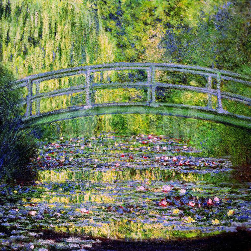
Pantone “Greenery”
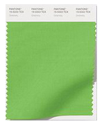 The Pantone Color Institute describes their yellow-green, spring shade as refreshing and revitalizing shade, symbolic of new beginnings. Meant to evoke those early spring days when nature is waking and awash in bright green, it signals a reset, hope, and life.
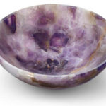
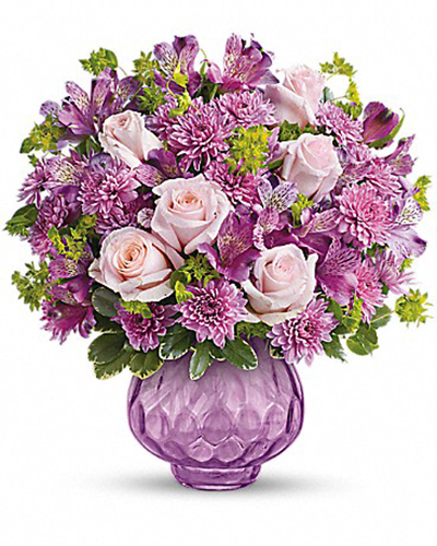
Benjamin Moore “Shadow”
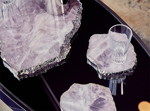
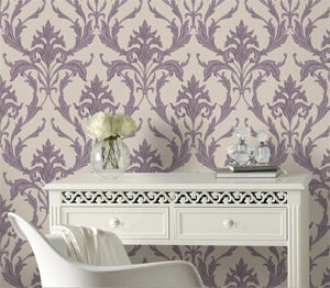
 The experts at Benjamin Moore named their dramatic purple selection “Shadow” because of their fascination with how it changes hue as the light changes throughout the day. It’s a rich, royal amethyst they describe as allusive and enigmatic.

Sherwin Williams “Poised Taupe”
 Sherwin William’s “Poised Taupe” is a marriage between conservative gray and earthen beige to create a “weathered, woodsy and complex neutral that celebrates the imperfections and authenticity of a well-lived life.” Both warm and cool, classic and modern, it is meant to be an organic, balanced neutral.


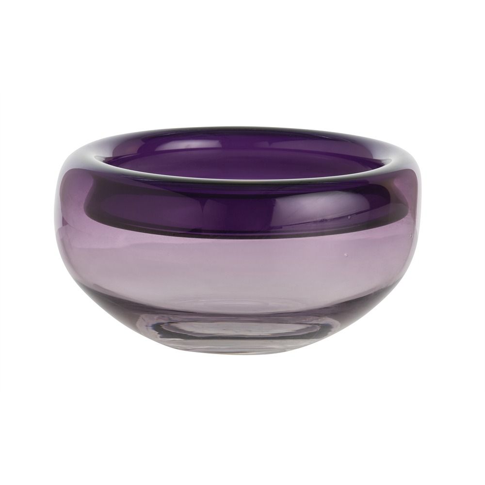
Glidden Paints “Byzantine Blue”
![]() Glidden Paints named a mystic purple-blue shade meant to be comforting and soothing, playful yet peaceful. The describe “Byzantine Blue” as a gender-neutral “purple in disguise” with all the best qualities of blue and gray. It morphs from hue to hue depending on what you partner shades you select.
Glidden Paints named a mystic purple-blue shade meant to be comforting and soothing, playful yet peaceful. The describe “Byzantine Blue” as a gender-neutral “purple in disguise” with all the best qualities of blue and gray. It morphs from hue to hue depending on what you partner shades you select.

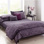
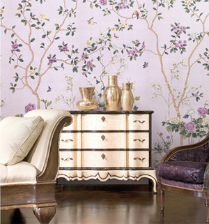
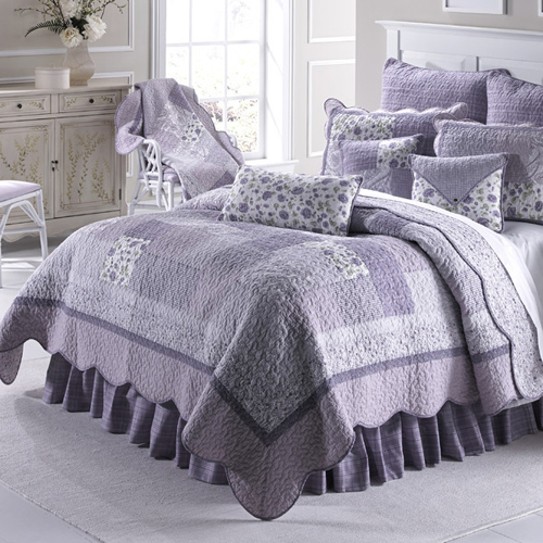
Olympic Paints “Cloudberry”
![]() Olympic Paints chose a soothing, lavender-purple the dubbed “Cloudberry” intended to be soothing, encourage meditation, and transform you space into a sanctuary. Cloudberry will float you away on a cloud to carefree, airy spaces.
Olympic Paints chose a soothing, lavender-purple the dubbed “Cloudberry” intended to be soothing, encourage meditation, and transform you space into a sanctuary. Cloudberry will float you away on a cloud to carefree, airy spaces.
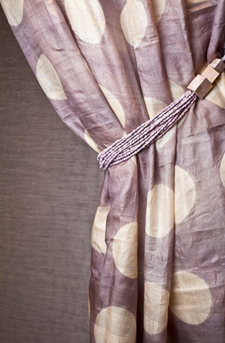
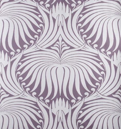
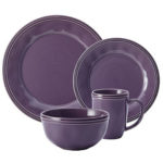
PPG Pittsburgh Paints “Violet Verbena”
![]() PPG Pittsburgh Paints selected a moody, gray-purple they describe as playful, elegant and calming. “Violet Verbena” is expected to appeal to those seeking the popular bohemian look as well as those looking to create luxurious, pampering spaces. It finds a middle ground between masculine and feminine, young and old, work and play.
PPG Pittsburgh Paints selected a moody, gray-purple they describe as playful, elegant and calming. “Violet Verbena” is expected to appeal to those seeking the popular bohemian look as well as those looking to create luxurious, pampering spaces. It finds a middle ground between masculine and feminine, young and old, work and play.
What do you think of the biggest colors predicted for 2017? Check out our pinterest board for even more Color of the Year images.