(847) 361-4358
Menu
Home
About
FAQs
Testimonials & Press
Blog
Contact
Collaboration
(847) 361-4358
Behr
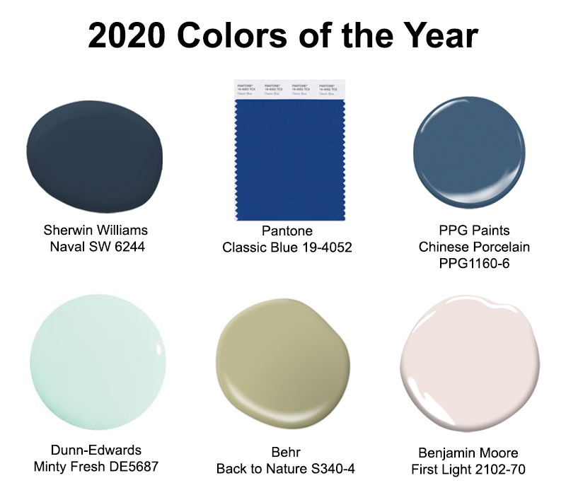
2020 Colors of the Year
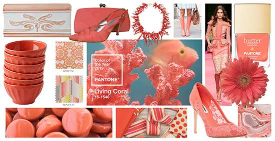
2019 Colors of the Year: Nature Meets Technology
Dress Up Your Home in the Latest Fall Fashion
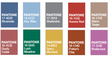
2015 Colors of the Year
Menu