Color me excited! The top names in color have made their annual Color of the Year announcements to ring in the new year. Soon you will see these colors on bridesmaids gowns, smartphone cases, and that must-have new handbag. Shoe brands from Converse to Jimmy Choo will tempt you with these colors.
- Radiant Orchid
- Exclusive Plum
- Breath of Fresh Air
Undoubtedly the biggest of the color trend-setters is Pantone. In a dramatic color-wheel contrast to their 2013 pick of Emerald Green, Pantone has chosen a bright pinky purple color called Radiant Orchid. This tropical, flirty shade is, well, radiant. Those chose it in part because it flatters almost any skin tone with rosy, healthy glow when worn. It also pairs well with a wide variety of colors so it can be easily be added to existing color schemes with simple accent pieces.
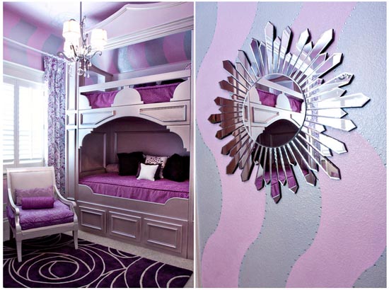
So, how do you best use Radiant Orchid in your home design? It is a bit loud for all-over color in most settings, but works well as a contrast wall and in accent pieces and trim. You can use it with bold colors like greens, blues, and reds, or it livens up neutrals like grays, whites, and browns. Here it makes for a bright kid’s room.
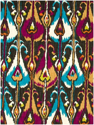
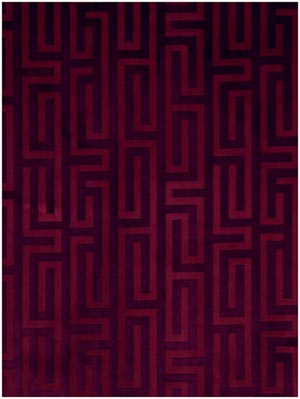
Before you dismiss Radiant Orchid as too juvenile, check out these gorgeous fabric designs by Robert Allen that incorporate Radiant Orchid.

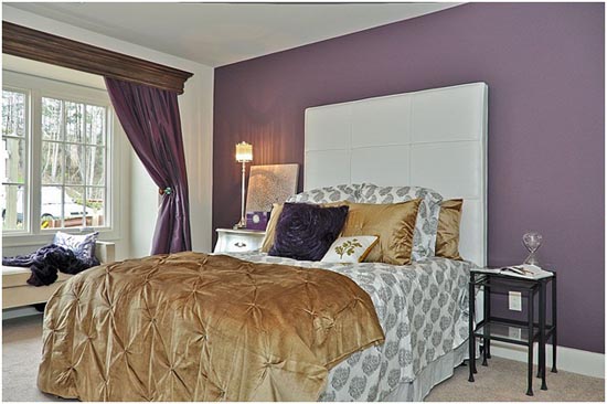
If Radiant Orchid is just too bright for you, the Sherwin-Williams color pick might be more your style. Exclusive Plum is a purple that leans more toward the blue hues, giving it a more earthy, chalky tone. This sophisticated color tends to change with the light from dark gray to bluish to purple. Here it has a masculine feel when paired with leather and rich woods or elegant and romantic paired with gold and white.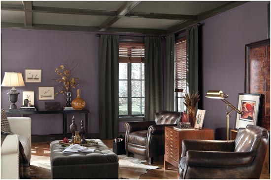
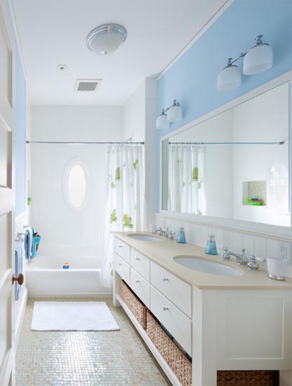
If Exclusive Plum is too heavy and somber for you, try this ethereal blue hue from Benjamin Moore. Breath of Fresh Air is soft and tranquil yet cheerful. Perhaps the most versatile of the color picks for 2014, it looks welcoming in a living room, clean and spa-like in a bathroom, dreamy in a bedroom, soothing in a nursery, or crisp and bright in a kitchen. It is part of the “new neutral palette” Benjamin Moore touts as livable and functional yet more interesting than the standard beige or white.
How do you feel about the 2014 color picks – in love or underwhelmed?