The New Year is underway and we’re all settling back into the normal routine after the holiday season. What a perfect time to revisit the 2022 Colors of the Year! These colors are selected to represent a range of feelings from carefree and confident to soothing and comforting. Let’s see what the big names in color picked and how to incorporate their choices into your life.
PANTONE 17-3938 Very Peri
For the first time ever, Pantone created a brand new color for their 2022 choice, a red-violet infused blue they dubbed Very Peri. Their marketing images display a range of purple-blue shades incorporating lighter and darker versions of their fun pick. They describe the color as “displaying a carefree confidence and a daring curiosity that animates our creative spirit” and “displaying spritely, joyous attitude and dynamic presence that encourages courageous creativity and imaginative expression”. That’s a lot of positivity to brighten your year! If you love it, try it in pops of color in your home décor or as a bold accent wall. Add it to your wardrobe for feel-good vibes all day. Here are some fun options we found:
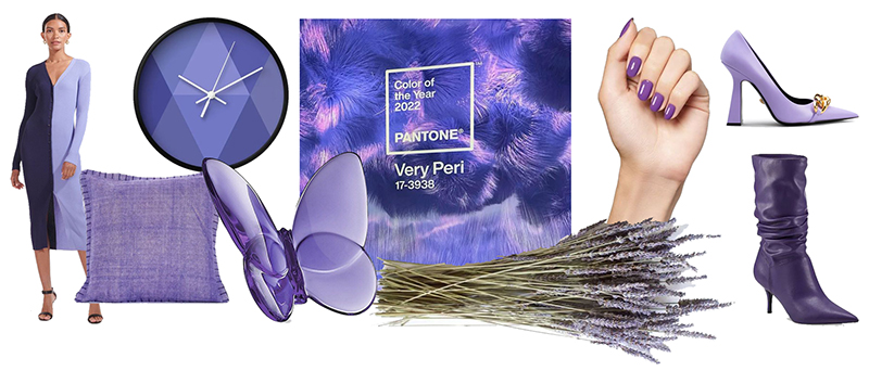
(Shoko Sweater Dress Staud; Geometric Wall Clock Etsy; Taylor Pillow Hedge Apple; Baccarat Butterfly Sculpture Saks Fifth Avenue; French Lavender Urban Outfitters; Nail Polish Cote Shop; Marc Fisher Boot DSW; Versace Pump Neiman Marcus)
Pantone’s ultra-short video (below) is a cool animation of the red / violet / blue infusion:
Dulux Bright Skies
UK’s leading paint company chose a happy blue color the call Bright Skies. They describe it as “an airy and fresh tone that opens up and breathes new life into any space”. It’s just bright enough for pops of color in accent pieces or and just neutral enough for wall color without overpowering your rooms. Here are some ideas to bring this color into your life:
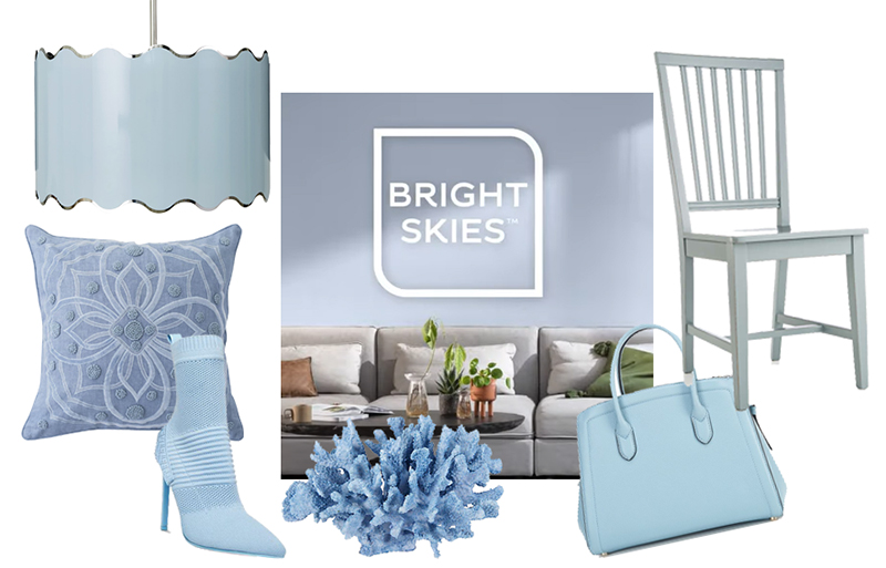
(Jonathan Adler Pendant Neiman Marcus: ; Berry and Thread Pillow Neiman Marcus; Stiletto Boot Steve Madden; Coral Sculpture Bed Bath & Beyond; kate spade new york Bag Dillard’s; Dining Chair Crate and Barrel)
Dunn Edwards Art and Craft DET682
Dunn Edwards selected a dusty red-brown hue called Art and Craft to harken back to days gone by, reconnect with nature and encourage handicrafts. They describe it as “nature-based hue that is moody and complex” with “sophisticated darkness destined to make it become a new classic”. It’s a cozy, comfortable color that works both indoor and out, as a base color or an accent.
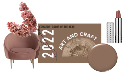
(Hydrangea AFloral; Razia Tub Chair Hedge Apple; Clinique Lipstick Dillard’s)
See their video on this choice here:
Behr Breezeway MQ3-21
2022 is a year for green shades according to several of the big names in color. Behr chose this summery, breezy soft blue-green called Breezeway MQ3-21 for the 2022 top slot. They describe the hue as “a relaxed and uplifting sea glass green expressing peace and tranquility for forward movement”. Sounds like a ride on a sailboat on sunny day. Sign us up! Described as sea glass green and silvery blue-green, Breezeway can look more blue or more green depending on surrounding colors. It’s a versatile color that goes with many palettes and is lovely in small dabs or as a base color, like these examples:
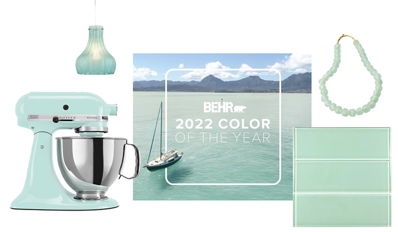
(Elk Home Pendant Luxe Decor; Stand Mixer KitchenAid; Subway Tile Modwalls; Sea Glass Beads Necklace Caitlin Wilson )
Their short video introducing the color will make you anxious for warm weather:
Benjamin Moore October Mist 1495
Benjamin Moore choose a muted sage green as their Color of the Year. October Mist 1495 is soft, comforting, and versatile shade of gray-green that makes a perfect neutral backdrop to a wide range of color palettes. They describe it as “evoking the silver-green stem of a flower” and encourage buyers to use it as an anchor to their chosen color palette. Here are some ways we found to use this color:
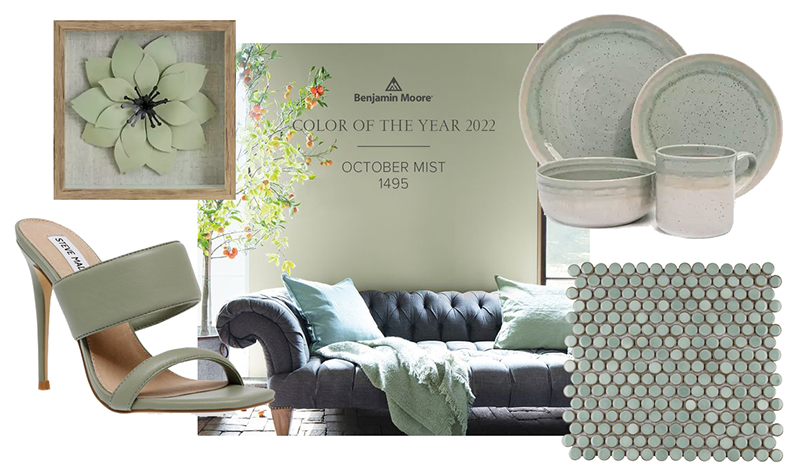
(Wall Decor Kirkland’s; Vegan Leather Mule Steve Madden; Porcelain Tile All Modern, Stoneware Belk)
Check out their video here:
Sherwin-Williams Evergreen Fog SW 9130
Sherwin-Williams selected a similar gray-green sage named Evergreen Fog SW 9130. “It’s a versatile and calming hue, a chameleon color of gorgeous green-meets-gray, with just a bit of blue. It’s a simple but sophisticated wash of beautiful, organic color for spaces that crave a subtle yet stunning statement shade,” according to Sherwin-Williams. Similar to Breezeway, this color makes a nice neutral base. Here are some examples:
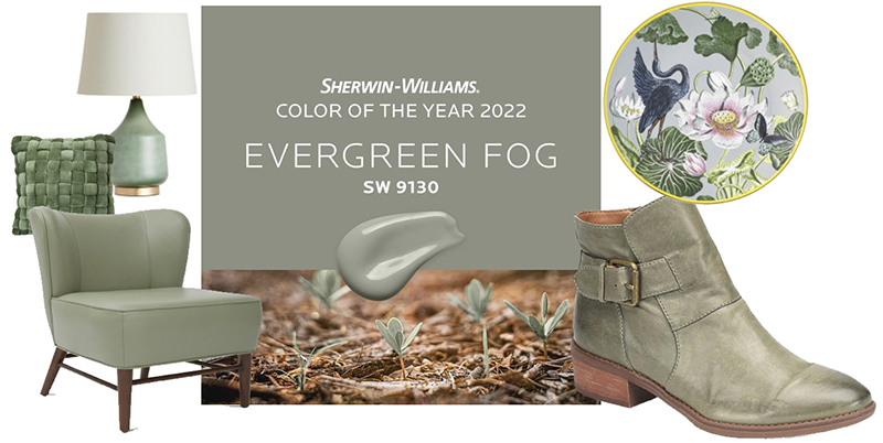
(Table Lamp World Market; Toss Pillow, Bitsy Leather Chair and Wedgewood Dinner Plate Burke Decor; Leather Bootie Dillard’s)
Here’s their intro video:
More Greens!
Like Benjamin Moore and Sherwin-Williams, PPG, Glidden and Dutch Boy all chose fairly muted, natural green shades. PPG describes Olive Sprig as “relaxed but enticing … brightening any space with organic liveliness”. Glidden describes Guacamole as a “spirited yet soothing green” that “brings an organic energy to any space” for a slightly brighter take on the back-to-nature theme. Dutch Boy describes Cypress Garden as “understated, clean and familiar” to “help to quiet our minds and bring comfort” with a hue slightly darker than the PPG top pick. Use these paint colors indoors or outdoors for equally beautiful results.
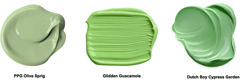
(images from PPG Olive Sprig; Glidden Guacamole; Dutch Boy Cypress Garden)
See more on our pinterest board for the 2022 Colors of the Year. Which is your favorite color?