The 2019 Color of the Year picks span the spectrum but there are two main themes: encapsulating nature and harnessing high tech.
Pantone 16-1546 Living Coral
Pantone is seeking to do both this year with it’s top color pick called Pantone 16-1546 Living Coral, a playful yet nurturing shade plucked from the coral reefs.
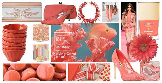
above: tile, Home Depot; shoes and clutch, Sole Divas; natural coral necklace, Betteridge; Wellingtons, The Hunt; Spring 2019 RTW Elisibetta Franchi, Vogue; nail polish, Ulta Beauty; bowls, Anthropologie; Fabric, Kravet; Living Coral, Pantone; gerber daisy, Fifty Flowers; penny round tiles, Wits End Mosaic; ribbon trim, Kravet; Lace Heels, Selfridges; cutting board, Bed Bath & Beyond
A smidgen too vivid to be pastel and a bit too soft to be classified with the brights, Living Coral finds a unique home for itself somewhere between the two just as it does nestled in the watery depths of soft blue waters and bright marine life. Referencing our emersion in social media and our need to find relief from the stress of the same, The Pantone Color Institute says Living Coral is “an animating and life-affirming coral hue with a golden undertone that energizes and enlivens with a softer edge. …Representing the fusion of modern life, Pantone Living Coral is a nurturing color that appears in our natural surroundings and at the same time, displays a lively presence within social media.”
This is a perfect shade for pops of color in neutral interiors, mixing particularly well with grays. It’s a bold choice as wall color but brave souls can enjoy a cheerful room with neutral furnishings inside coral walls. We especially love the Kravet fabrics designed around Pantone’s COTY for gorgeous chairs, throw pillows and curtains. Check out our pinterest board for more ways to incorporate Living Coral into your everyday life.
Benjamin Moore Metropolitan AF-690
Benjamin Moore, one of America’s leaders in paint and stains, picked a sophisticated, versatile silvery-gray called Metropolitan AF-690 as their 2019 Color of the Year.
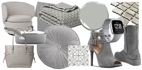
above: chair, West Elm; throws, Target; paint, Benjamin Moore; tile, Tile Bar; Michael Kors purse, Rachel Ray cookware, and round pillow, Macy’s; mosaic tile, All Modern; Michael Kors bootie, Macy’s; Fitbit and Uggs, Nordstrom
This shade is comfortable and soothing with just enough pop to look glamorous in contemporary and modern designs. According to an interview with Architectural Digest, the color guru’s at Benjamin Moore take the yearly pulse of the globe to decide on their COTY. This year the theme they discovered time and again was “pause,” reflecting a longing for stepping back from the hurry-scurry to immerse in needed moments of quiet. The slight hint of silver seems to evoke a heartbeat of high-tech just behind calm in this nuanced gray.
Gray has been popular in both interior design and fashion for several years now and is highly adaptable to many color schemes and styles. Check out our pinterest board for ways to use Metropolitan AF-690 in your new year.
The Go-To Blues
If blues are your go-to color choice, several of the top brands are singing your tune.
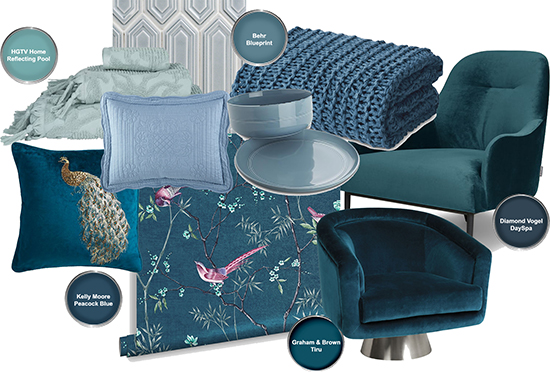
above: towels, Nordstrom; tile, Tile Bar; pillow sham, JCPenney; dishes, Crate and Barrel; knit throw, Macy’s; high back arm chair, Article; peacock pillow, Pier1; wallpaper, Graham & Brown; round chair, Jonathan Adler;
HGTV Home by Sherwin-Williams, selected a pretty, light blue called Reflecting Pool they describe as a versatile color that is fun and elegant.
Behr, another industry leader, chose a muted, medium blue they named Blueprint S470-5. An “honest, approachable color” inspired by architectural blueprints, Behr says Blueprint “creates a space where you can build your own reimagined life” and is a calls to action. It evokes honest labor and industrial and metropolitan themes. A versatile interior design color choice, muted blues are popular cabinet colors, especially in kitchens. See ways to use Blueprint on our pinterest board.
Diamond Vogel chose a nearly navy shade called DaySpa. Inspired by nature, mind and body, Diamond Vogel calls this a “deep, introspective” blue. This is a fabulous color for exterior doors and shutters. Navy is gaining popularity in home design in recent years. Most cabinet manufacturers have painted cabinets in gorgeous navy shades.
If you prefer a more dramatic blue, Kelly-Moore Paints named the vibrant Peacock Blue as their top pick. Graham & Brown chose a knockout teal called Tiru taken from the backdrop of the Tori wallpaper and inspired by the Kabuki trend, a classical Japanese drama-dance with a bold color palette.
Going Green
The color of nature and balance, green will always resonate as a soothing, restorative color. A few of the paint brands are going green in 2019.
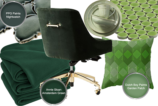
above: dark green tile, Tile Bar; chair, Anthropologie; dishes, Pottery Barn; green penny round tile, Tile Bar; blanket, Hayneedle; geometric pillow, Society6
PPG Paints chose a dark, nearly black green called Nightwatch PPG1145-7 that they describe as lush and luxurious inspired by the healing power of nature. Just a couple shades lighter, Annie Sloan Paint selected a deep green called Amsterdam Green inspired by the painted shutters and doors of Amsterdam. Both of these deep greens work well as accent colors. Check out more ways to use PPG Nightwatch on our pinterest board.
Dutch Boy Paints selected a botanical green called Garden Patch 326-5DB to offer “rejuvenation and peace” in our homes. We’ve found lots of ways for you to use Garden Patch on our pinterest board.
Saddle Up with the Naturals
Several of the paint brands selected top picks that evoke the desert, terracotta and clay, natural caverns, rich spices and sunsets. Saddle up for a trail ride to the more rugged side of nature.
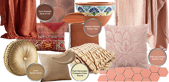
above: throw, West Elm; tile, Pratt and Larson; multi pillow, Pottery Barn; copper pillow, West Elm; terracotta bowl, One Kings Lane; pink waffle throw, West Elm; round pillow and faux fur throw, Macy’s; natural fiber pillow and pink pillow, Pottery Barn; hexagon tile, Fire Clay Tile
Dunn-Edwards top pick, Spice of Life DET439, was inspired by the adventurous, exciting, flavorful aspects of an authentic life. Things like spice-markets, the American West, and even exploring the red planet, Mars. It’s exotic, yet folksy. It’s a desire to be rooted deep in the earth instead of lost in technology. Check out ways to use Spice of Life on our pinterest board.
Sherwin-Williams chose a warm terracotta called Cavern Clay SW 7701 they describe as midcentury modern meets the American Southwest. This earthy color, inspired by beaches, canyons and deserts, can be refined or casual. See ways to incorporated this color into your life on our pinterest board.
Pratt & Lambert chose a soft pinky terracotta called Earthen Trail 4-26 from their Preserve palette inspired by the softer side of plains, deserts, and sunsets.
The color experts at Dulux wanted a color to “reflect the new positive mood of the moment” that was versatile enough to be either soothing or vibrant. They chose Spiced Honey based on the color of natural honey for a cozy yet sophisticated neutral. It also blends beautifully with our desert naturals.
Ace Hardware did something fun with it’s Clark + Kensington paint line – they held a contest for customers to mix their own shades and submit them for 2019 Color of the Year. The winning color, Pineapple Cream Granita, was created by a New Jersey native Francine C. at her local Ace Hardware store. It’s a creamy neutral that pairs well with our naturals. Good job Francine!
