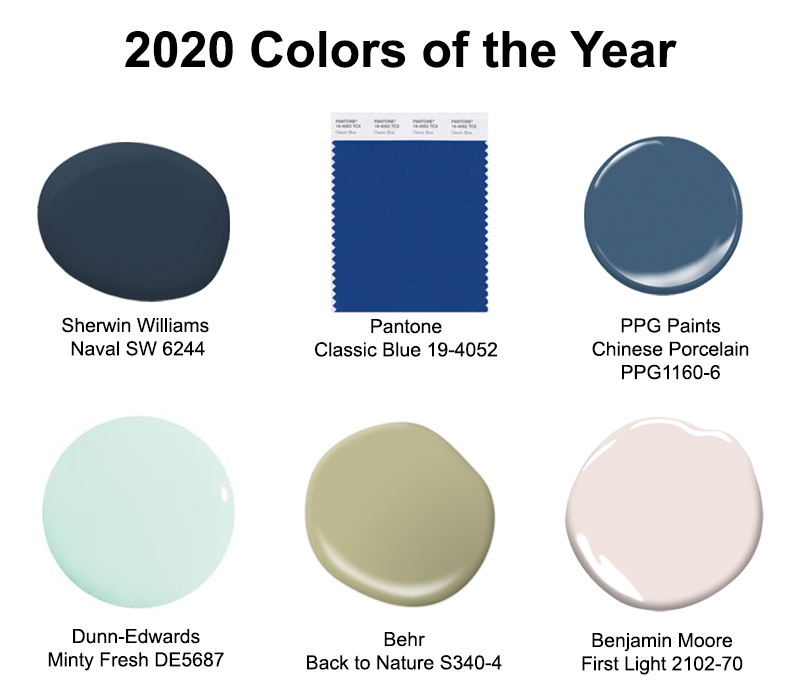
The 2020 Colors of the Year were announced in late 2019 and there were a bunch of them. You’ve probably seen them all but we’ve distilled the best-of-the-best to show you with some ideas for how you can use them in your home. This year highlights blues, greens and blush colors found in nature.
Such pretty eye candy! Let’s break them down:
Sherwin-Williams “Naval” SW 6244
Dark blues have been growing in popularity in recent years. We’ve seen more and more kitchen and bath cabinets using beautiful deep blues inspired by the sea. Sherwin-Williams chose this rich navy that they describe as creating a calm grounding environment infused with quiet confidence, paving the way to a new decade of wellness of the mind, body and soul. The company further says the color gives a nod to Art Deco influences, the power of nature, and the importance of our need as humans to interact with nature. Sounds like quite an inspiring color!
Check out our pinterest board for many more examples for incorporating this color in your life.
Pantone “Classic Blue” 19-4052
Pantone Color Institute chose a blue they dubbed “Classic Blue” for it’s solid and dependable feel. They describe it as elegant in its simplicity and suggestive of the sky at dusk, thought provoking, reassuring, and stable. Executive Director Leatrice Eiseman said this of the choice: “Classic Blue provides and anchoring foundation. A boundless blue evocative of the vast and infinite evening sky, Classic blue encourages us to look beyond the obvious to expand our thinking; challenging us to think more deeply, increase our perspective and open the flow of communication.” You can explore their color suggested color pairings on their website here.
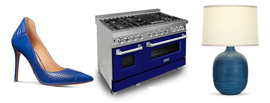
Brighter than Naval, this blue is still a solid and popular choice for kitchen and bath cabinetry. See our pinterest board for many examples of this classic color from home décor to fashion.
PPG Paints “Chinese Porcelain” PPG1160-6
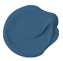
Brighter than Naval but darker and more muted than Classic Blue, Chinese Porcelain gets the special nod from PPG Paints. They describe the color as blend of cobalt and moody, ink blue. It evokes natural elements like the sea and the sky, imparting calmness, hopefulness, serenity and sense of long tradition. PPG color specialists see the new decade as leaving behind neutrals like gray for more colorful backdrops. As the most popular favorite color, blue is the “easiest possible entry point” from neutral to color.
Check out our pinterest board for many gorgeous ideas to use this color this year.
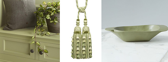
Dunn-Edwards “Minty Fresh” DE5687
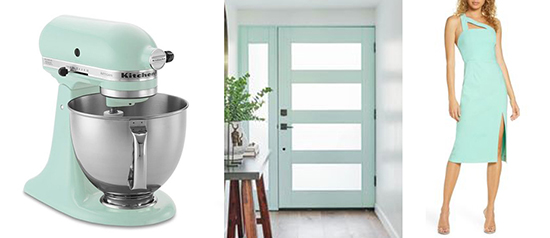
Dunn-Edwards choose a sweet, nostalgic pastel shade of minty green they call Minty Fresh for it’s fresh, clean feel. The company describes it as a subtle and relaxing pastel that conveys a partnership between technology and nature, bringing both an optimistic, upbeat feel and a tranquil balance. This color finds a home on many a front door and garden gate, but is no stranger in graphic design.
See our pinterest board for all the many places we discovered this shade in current home décor and fashion.
Behr choose a muted, organic green hue that looks to be straight from the forest or a meadow. They describe the color as restorative and revitalizing, fulfilling the need to create a soft landing at home. Behr sees the trend of bringing the outside indoors as continuing into new decade and a need to engage with nature will be ever more important in the hustle-and-bustle of 2020.
See all the ways we found to use this organic green on our pinterest board.
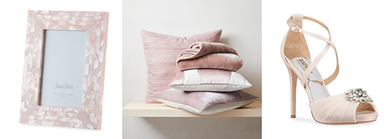
Benjamin Moore “First Light” 2102-70
Benjamin Moore sees this light, rosy pink as the defining shade to a new decade. They describe it as an uplifting, refreshing neutral that is soft, airy, and plays well with other colors. It’s a happy shade without being sticky sweet, luminescent and reflective without being too bright, and just crisp enough to look clean without feeling sterile. The company says it’s a cooler take on the very popular Millennial Pink that they see as continuing throughout this new decade.
See our pinterest board for all the ideas we found to bring this pretty pink into your new year.
All the colors speak to a link between nature and technology and a need to slow down and relax in a rushed and hectic world. (Sounds blissful!) The terms revitalized, optimism, and fresh appear in most of the color descriptions released by the companies. Do you love them?

