Last week I introduced you to Pantone’s 2012 “Color of the Year”- Tangerine Tango. It’s bold isn’t it? Perhaps a little too bold for those of you who are color shy, or even color-phobic? Not to worry. There are actually several “Colors of the Year” that you will see promoted by paint companies, fashion houses and other companies that promote color products. Perhaps one or two of these might even feel more comfortable for you to “try on”.
On a recent expedition to the Kravet showroom in Arlington Heights at the Arlington Design Center, I came across a couple of vignettes that perfectly capture the art of utilizing bits of bold, dramatic color against a backdrop of neutrals. I’ll show you these going from the more timid use of color to bolder incorporations.
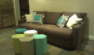
#1. Here’s a great example of color pops with a neutral background. The good news is that if you tire of the colors or want to change them, you don’t have to start from scratch!

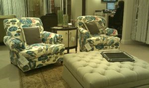
#2. The next photo is a little bolder, with a large, colorful print on some chairs. You can’t see the sofa, but it and the rug are both neutrals.

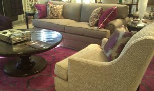
#3. Last but not least for today. This may be a tough one for color- phobes. While the large expanse of color in the rug could overwhelm some, it really creates warmth and interest and beckons you to come and relax.

So that’s our color excursion for this week! My goal this month is to help you embrace color, in whatever way you can! Be sure to check out our Facebook page later this week for more examples of color for your home. www.facebook.com/catherineschagerdesigns
