(847) 361-4358
Menu
Home
About
FAQs
Testimonials & Press
Blog
Contact
Collaboration
(847) 361-4358
Interior Designer
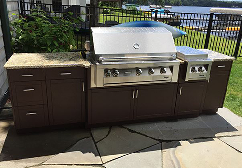
Take it Outdoors I
What Will Cabinets be Wearing in 2021?
Looking Ahead to 2021
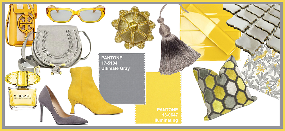
2021 Colors of the Year: Optimism, Comfort and Wellness
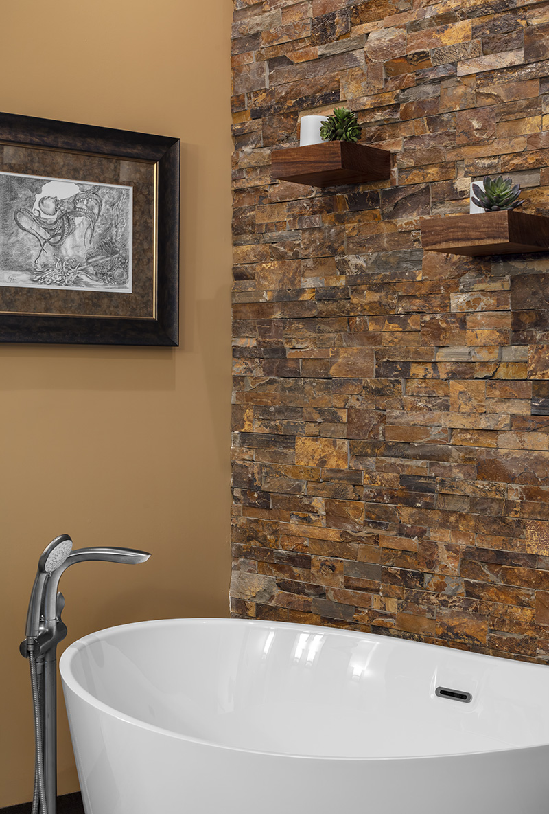
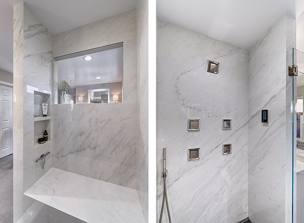
Houzz Bathroom Trends
Houzz 2020 Trend Report for Bathrooms
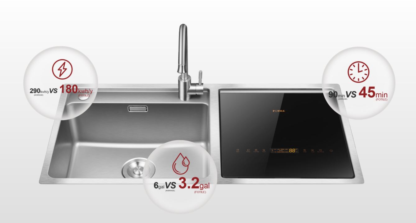
Product Innovator Awards from KBIS 2020!
A WELL – Designed Kitchen
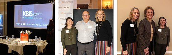
NKBA Event with Ellen Cheever February 2020
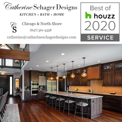
“Best Of Houzz” Badge for Service 2020
1
2
3
4
5
Next
Menu